User controls are extremely easy to use and any person with a very few knowledge in JavaScript or HTML can build there own user control.
With the release of GeneXus Evolution 1, there was an explosion of user controls in the GX Community. The Community started developing not only user controls, but also developed libraries of User Controls. The user controls are not only just a simply menu or chart, they become controls with very complex functionality.
Nowadays there are around a hundred of user controls, and I want to share my 3 preferred ones.
Query Viewer
The query viewer is used to display, in a web form, the result of a Query Object or a Data Provider. It has several visualization options, such as pivot table, table or chart and this property can be changed on run-time. With the QueryViewer User Control and the Query Object we can achieve very complex queries in a very simple way. We just need to define a query objectand we use the query viewer to show the result of the query.
Here is an example of how easy is to use it.
First define the query on a Query Object:

After we have the query defined we need to drag and drop the query viewer user control from the user control section on the toolbox to a web form and set the Object we want to use for the query, for this example, we choose the Query Object KPI_Cost.

With the query viewer and the query object we can create and display very complex queries like the following in a few steps.
As a reference here is the link to the query viewer control in the wiki. There you will find a full explanation on how to use it and several examples.
http://wiki.gxtechnical.com/commwiki/servlet/hwiki?Query+Viewer+Control,
GXScheduler
The GXScheduler user control allows managing a schedule of chronological events. As most calendars, there are three different views; by day, by week or by month.
Apart from showing the calendar events in a very nice and modern way, it is also extremely user friendly as it allows to add, edit and delete the calendar events directly from there. As an example, the user in order to create a new event, just needs to click over the date on where he/she wants to put the event. This is a clear example of how the user controls are not just anymore a simple chart or image gallery.
This UC provides a very complex functionality and is also extremely easy to use.

In order to use it, we just need to create a data provider from the data that we are loading into the calendar. After that we need to drag and drop the UC to a web form and we set the Data Provider, then we need to set the property LoadEventObject of the user control.
As a reference here is the link to the GXScheduler control in the wiki. There you will find a full explanation on how to use it and several examples.
http://wiki.gxtechnical.com/commwiki/servlet/hwiki?Scheduler+User+Control,
gxui Library
The gxui Library has 11 user controls, most of them are used to create cool and user friendly user interfaces.
Which are: gxui.EventObject, gxui.Grid, gxui.Layout, gxui.Menu, gxui.Message, gxui.Panel, gxui.Settings, gxui.TabPanel, gxui.Toolbar, gxui.Treeview and gxui.Viewport.
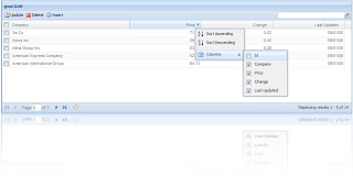
The gxui.Grid is a very powerful grid in which you can sort for each column, hide and show the columns at run-time, interchange the columns, or (display in this example) swap the Price column with the Change column. It also allows multiple row selection. It has a search criteria section and automatic paging. This UC is not very simple to use but in GeneXus Evolution 1 we can give the appearance and functionality of the gxui.Grid just setting a property on a common grid.
This UC divides the screen in 5 sections, north, south, east, center and west and the user can expand or collapse each section. Another functionality that it provides is to drag and drop a panel of each section to another section so the user has the ability to customize their own screen. In this picture there are almost all the user controls from the gxui Library.
As a reference here is the link to the gxui Library in the wiki. There you will find a full explanation on how to use it and several examples.
http://wiki.gxtechnical.com/commwiki/servlet/hwiki?Category%3Agxui+Library,
You can find a lot of documentation for user controls. Here are some useful pages on where you will find all the information you need to start using them or discover new user controls.
Each time you are going to start a new development or feature, take your time to see if there is a user control that already solves what you need to do, you will save a lot of time!
Wiki user control page:
http://wiki.gxtechnical.com/commwiki/servlet/hwiki?Category%3AUser+Controls,
Gallery:
http://gallery.genexus.com/
User Control samples:
http://wiki.gxtechnical.com/commwiki/servlet/hwiki?GeneXus+Live+Samples,


Hello. How are you?
ReplyDeleteCan you explain a little more about the user control Query Viewer? and how to load it from a Data Provider? Thanks.